I’ve spent a bit of time this weekend looking at a possible new design for the ContentBox admin interface.
So I’ve done a couple of options so far, one with the main navigation running across the top similar to how it is now and the second with it down the side. Initial thoughts on colour schemes were that the accent colour and background would be customizable via admin settings allowing the user to tailor it to match its website counterpart.
At this stage these are just my thoughts on what the ContentBox admin could look like and would really like to hear everyone else’s opinions, questions or suggestions.
Very nice job! I like how clean and minimal it is–looks like it would be easily implementable via Bootstrap.
Of the two navigation schemes, I definitely prefer the sidebar style.
RE: the admin options, one thing we discussed off list was doing a SASS implementation of the new admin theme. This would allow for not only simple changes like accent and main colors, but even more granular control if desired. Plus, with the SASS approach, documenting the theme would be really easy and help those who really want to go further with modifications…not to mention making ongoing maintenance and extension much easier and transparent.
Thanks for sharing these–they look really great IMO!
True he did, I had missed that. The other problem I have is that the menu navigation WILL need to be on the side for customization as there is not enough room at the top any more.
I definitely agree on the side-nav, Andrew. Having collapsible, groupable vertical nav will allow not only for growth in the core, but also (and especially) for custom extensions.
These are just mockups at the moment. I didn’t want to spend hours coding it before getting feedback. So still easy to change.
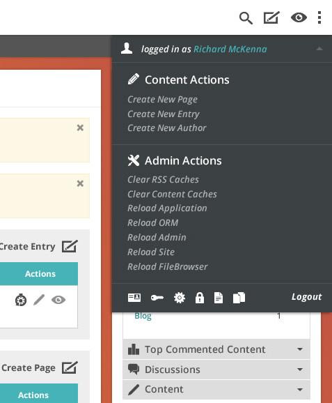
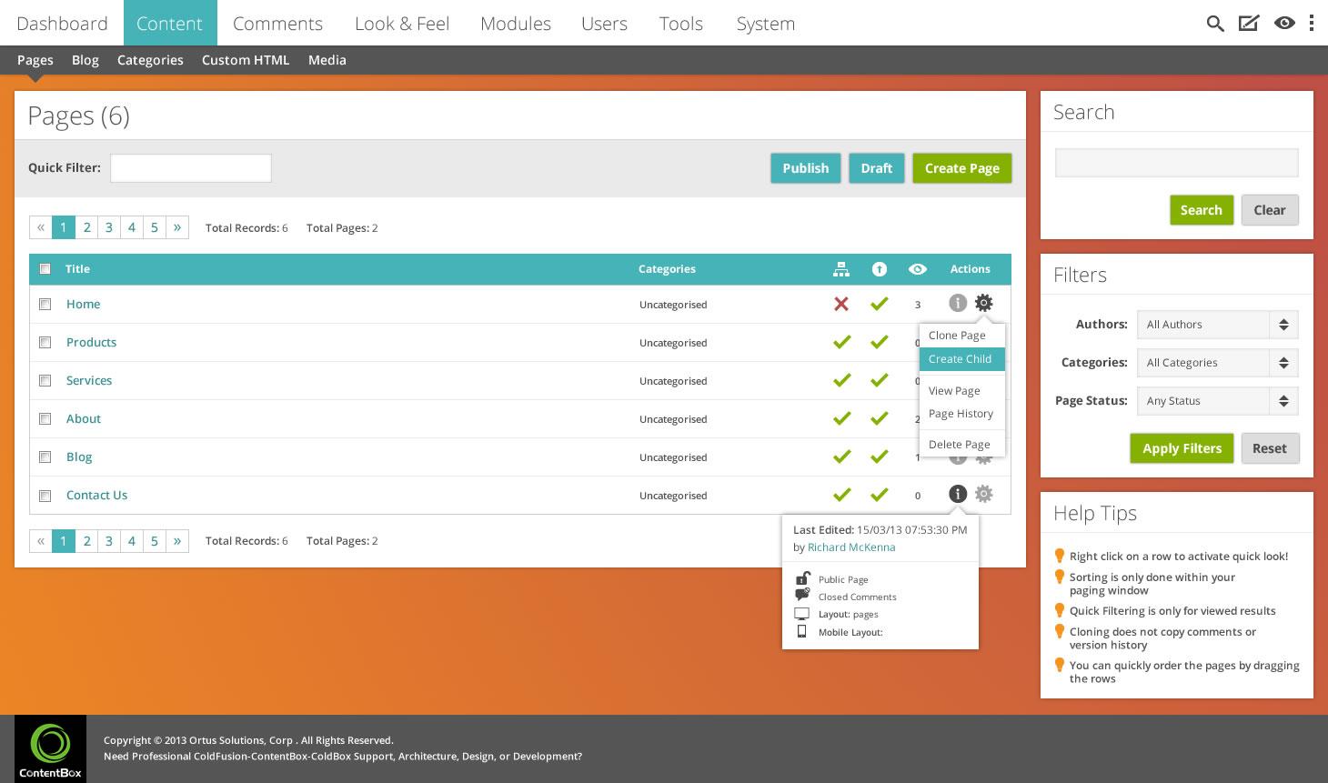
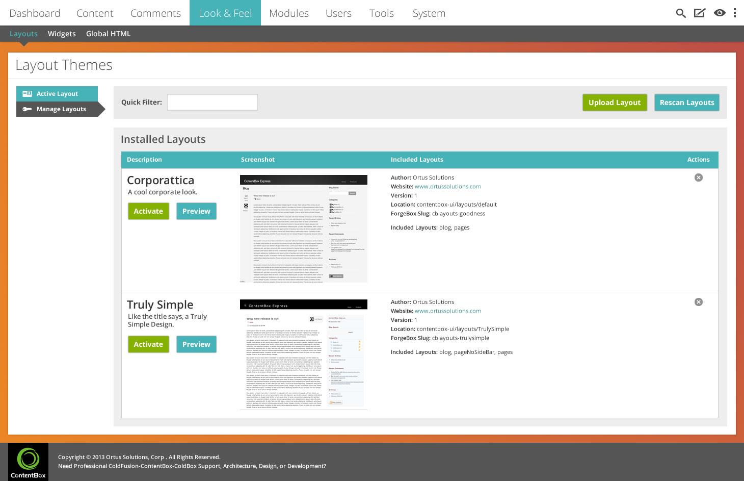
I initially set out to re-skin the current interface, wanting something clean but adaptable. On showing Luis the concept he asked if I could do the vertical navigation, hence the last 2 images. I know colour schemes are a very subjective thing hence wanting to make them easily changeable. There are many reasons for me choosing the colours I did, mainly to help key elements stand out. Along with standard colours for constructive/destructive actions (green/red), keeping it to 2 main colours (accent and background) would make it simple to get a totally different look.
CSS preprocessor, definitely. I’m more of a LESS man myself, but either would be good. As bootstrap seems to be the front end framework of choice maybe LESS would be the most consistent choice.
I’m all for making ContentBox the “stand out” ColdFusion CMS and would like to help anyway I can.
I created the new branch in the repo so we can collaborate as this grows.
I like the vertical nav, so let’s go with that approach. I would only like a way to collapse the navigation so it can give more space to the content. Also, what do you guys think of adding an Icon to each main menu? Should only the top level have icons, or should the top an sub levels?
Colors, let’s pick some but use LESS for the majority of variables so we can customize.
Implementation.
The first step would be to implement the skin using latest JQuery and Bootstrap as we will need to migrate all the current JQuery Tools Javascript and styles.
Richard how do you want to proceed, we are all here eager to help out.
RE: the icons, I think it would be good to have an icon for each top level menu item–that way, at some point, maybe we could have a collapsed “mini-menu” that’s only icons. I would say it would be good, though, to build in a capability for having submenu item icons, in case someone wanted to implement that in their custom section. For core, though, I think just top level is good.
As we get moving on this, please let me know how I can help out. I’m happy to help with HTML/CSS/LESS stuff, with the transition from jQuery Tools to jQuery/Bootstrap, etc, making icons, whatever. However I can be helpful, just let me know…really excited to see this happening!
I like the idea of the top level items each having icons. The more I look at it, I’m not convinced about the second level items. I think it’ll start turning into a bit of an “icon fest”. It looks a bit cleaner without them as well.
Onto bootstrap - bootstrap 3 seems to be on the cusp of being released, though they haven’t given an official release date yet. There are some major changes to the grid system, forms and icons which would be nice to take advantage of. Have a look there is a nice long list of changes here https://github.com/twitter/bootstrap/pull/6342
Features like the icons which now use @font-face rather than pngs and the responsive stuff.
I think the first step would need to be building the overall layout and containers for the content and setting up styles/markup for common elements such as text, panels and menus etc. Of course we would need to make a decision on whether to build in bootstrap 3 before it’s actually released or not, due to the grid changes.
I’m happy to jump into all the initial stuff but would certainly appreciate help with JavaScript and re-factoring all the views. As I’m the new guy here I don’t want to step on any toes, so just put me in my place if I do
Anyway I’ve attached a couple more menu mock-ups for your viewing pleasure.
I like the collapsed menu—will be very handy and looks awesome.
Count me at your disposal for all these things. Maybe those who want to be involved in this should have a short planning session soon to identify the action plan, responsibilities, etc.
Badges are a nice idea. I think using the top right is good, which could also be used for other global stuff if needed. I think persisting them is better, since some notifications (for example, “You have an approval for xyz waiting…”) would be beneficial to live until explicitly dismissed. There should be a service that can allow you to easily register notifications from within modules.